

Bilder für bessere mobile Performance richtig skalieren
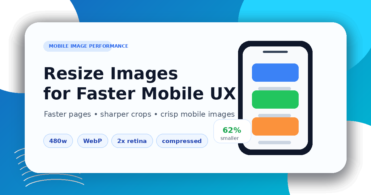
Bilder für bessere mobile Performance richtig skalieren
Mobile pages need images that are sized for the real layout, not oversized desktop originals. Start by checking where the image appears: hero section, product gallery, blog cover, card thumbnail, icon, or logo.
Use the Image Resizer to set the target dimensions, then use the Image Compressor to reduce file size. If another format is better for the web, convert a copy with the Image Converter.
Keep the ratio, avoid stretching
Do not force a portrait or square image into a wide cover by stretching it. Preserve the aspect ratio, crop intentionally when a fixed layout requires it, and keep important content inside safe margins.
For blog and social covers, prepare a dedicated 1200×630 image instead of distorting an existing asset.
Mobile image checklist
- choose the displayed size before exporting
- keep a consistent aspect ratio
- compress after resizing
- preview on a phone-sized screen
- check text, faces, product edges, and transparent areas
Good mobile performance comes from preparation: resize first, compress carefully, and publish images that match the layout.
Verwandte Beiträge
How to Compress Images for Faster Page Speed
A practical workflow for smaller pages, cleaner Core Web Vitals, and fewer visual artifacts.
Bilder vor dem PDF-Export vorbereiten
Praktische Checkliste zum Skalieren, Komprimieren, Sortieren und Konvertieren von Bildern vor dem PDF-Export.