How to Pick Accessible UI Colors in 2026
How to Pick Accessible UI Colors in 2026
Picking UI colors is not only a branding decision. It directly affects readability, focus, error prevention, and whether a product feels trustworthy to use.
If your buttons look beautiful but the text is hard to read, the palette is not doing its job. A good accessible color system should make the interface clearer before it makes the interface more decorative.
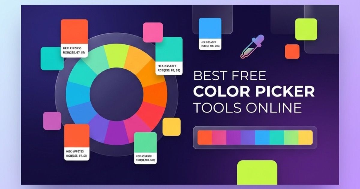
If you want a fast way to explore palettes and convert values, start with the Anything Tools Color Picker.
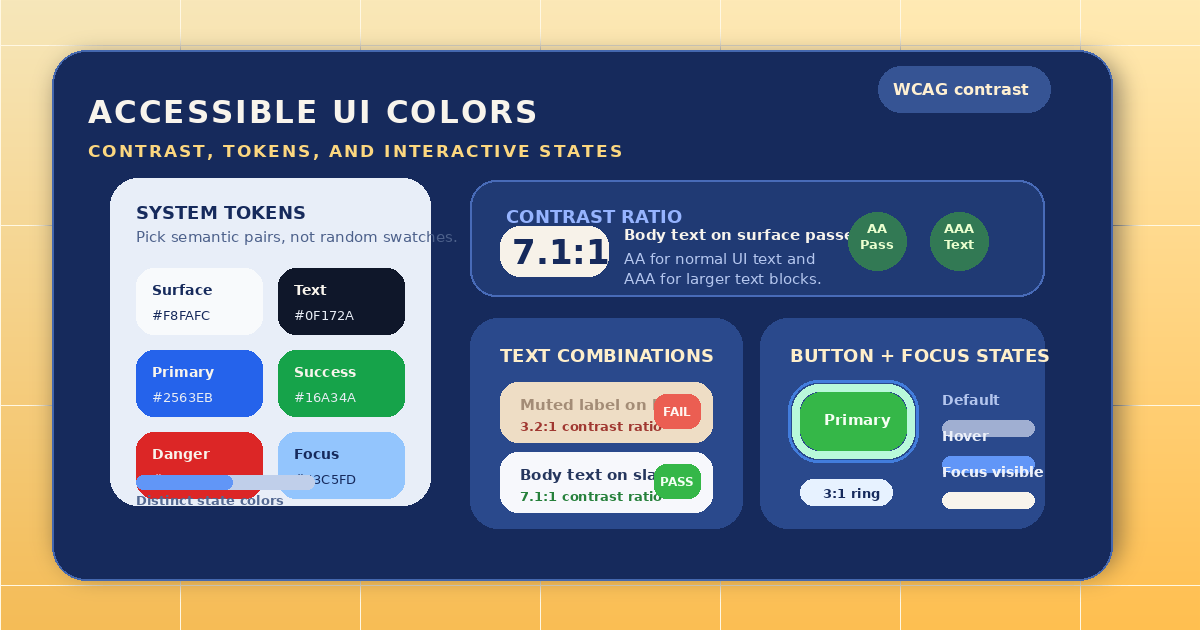
Start with contrast, not aesthetics
Many teams begin with a primary brand color and spread it everywhere. That usually creates problems because one accent color rarely works equally well for text, backgrounds, borders, badges, charts, and disabled states.
Start with the surfaces that users read most:
- body text on the main background
- secondary text on muted panels
- buttons and links
- success, warning, and error states
For normal text, you usually want contrast that comfortably meets WCAG expectations. For larger UI elements, you still need enough separation so users can recognize what is clickable, selected, or dangerous.
Build a small color system instead of one perfect hex value
Accessible interfaces are easier to build when each role has a purpose. In practice, that means defining a small set of tokens such as:
- page background
- primary text
- secondary text
- border color
- primary action
- success
- warning
- error
Once those roles are clear, you can create lighter and darker variations without guessing every screen from scratch.
The goal is not a huge palette. The goal is consistency.
Check real UI states, not isolated swatches
A color can look fine in a design board and still fail in the product. Always test colors inside realistic components:
- a primary button with text
- an input with placeholder text
- an error message below a field
- a selected tab
- a disabled action
This matters because accessibility problems often come from combinations, not single values. A soft gray label may look acceptable on white, but become unreadable inside a tinted card or next to a thin border.
Use HSL or structured scales when tuning
When teams only edit random HEX values, palettes become hard to maintain. A better workflow is to adjust hue, saturation, and lightness deliberately.
That makes it easier to answer practical questions such as:
- should this warning be darker or less saturated?
- is the border too close to the card background?
- do we need a stronger hover state or just a slightly darker tone?
The Anything Tools Color Picker is useful here because it lets you move between HEX, RGB, and HSL quickly while exploring harmonies and shade variations.
Avoid the most common accessibility mistakes
The same problems appear again and again:
- using light gray text because it looks modern
- relying on color alone for status and validation
- picking red and green pairs that collapse for color-blind users
- making focus rings too subtle
- putting text on gradients or tinted surfaces without retesting contrast
A simple rule helps: if a state matters, it needs more than decoration. Use contrast, weight, icons, labels, or shape changes together.
Document the palette so engineers use it consistently
Accessible colors fail when the design system lives only in screenshots. Write down the actual tokens and intended usage. If your team shares tokens in config files, documentation, or handoff notes, clean formatting also helps reduce mistakes. For that workflow, the Anything Tools JSON Formatter can help review color token objects before they go into a codebase.
Useful documentation usually includes:
- the token name
- the exact value
- the intended background
- allowed text usage
- hover and active variants
A practical browser-based workflow
For most teams, a lightweight workflow is enough:
- Pick a starting brand or interface color.
- Generate nearby shades and harmonies.
- Test text, borders, and actions on real backgrounds.
- Reduce weak low-contrast combinations.
- Save the final token set in a reusable format.
This is faster than redesigning each screen independently, and it creates a system that scales better as the product grows.
Final takeaway
Accessible UI colors should make decisions easier for users. That means readable text, clear actions, and states that remain obvious under different lighting conditions, screens, and visual abilities.
Treat color as interface structure, not ornament. If you want a quick place to start building that structure, use the Anything Tools Color Picker and test the palette in realistic UI components before shipping.
Related Posts
Die Besten Kostenlosen Online-Farbwähler-Tools in 2026
Entdecken Sie die besten kostenlosen Online-Farbwähler für Designer und Entwickler. Vergleichen Sie Funktionen, Formate und Barrierefreiheitsprüfungen.
Favicon-Generator Leitfaden: Größen, Formate und Browser-Tipps
Erstelle ein zuverlässiges Favicon-Set, wähle die Ausgangsgrafik, prüfe den Kontrast bei kleinen Größen und bereite Icons für moderne Browser vor.