Image Optimization for Website Speed: Complete 2026 Guide

Image Optimization for Website Speed: Complete 2026 Guide
Images are the #1 cause of slow websites. This guide covers everything you need to know about image optimization for better performance, SEO, and user experience.
Why Image Optimization Matters
The Numbers
- Images account for 50% of average page weight
- A 1-second delay reduces conversions by 7%
- 53% of users abandon sites that take 3+ seconds to load
- Google uses page speed as a ranking factor
Core Web Vitals Impact
Images directly affect:
- LCP (Largest Contentful Paint): The biggest image is often the LCP element
- CLS (Cumulative Layout Shift): Images without dimensions cause layout shifts
- INP (Interaction to Next Paint): Large images block the main thread
The Complete Optimization Checklist
✅ Choose right format (WebP/AVIF with fallbacks)
✅ Resize to actual display size
✅ Compress appropriately (70-85%)
✅ Use responsive images (srcset)
✅ Implement lazy loading
✅ Set width and height attributes
✅ Use CDN for delivery
✅ Enable browser caching
✅ Consider image sprites for icons
✅ Use SVG for logos/icons
Step 1: Choose the Right Format
Format Decision Matrix
| Content Type | Best Format | Fallback |
|---|---|---|
| Photographs | AVIF → WebP | JPG |
| Graphics/logos | SVG | PNG |
| Screenshots | WebP lossless | PNG |
| Icons | SVG | PNG sprite |
| Animated | WebP | GIF |
| Hero images | AVIF → WebP | JPG |
Implementing Modern Formats
<picture>
  <source srcset="hero.avif" type="image/avif">
  <source srcset="hero.webp" type="image/webp">
  <img src="hero.jpg" alt="Hero image" width="1200" height="600">
</picture>
Browser picks the first format it supports.
File Size Comparison
Same photo at 1200px width:
| Format | Size | Savings |
|---|---|---|
| PNG | 2.8 MB | - |
| JPG 85% | 280 KB | 90% |
| WebP 85% | 180 KB | 94% |
| AVIF 75% | 120 KB | 96% |
Always use AVIF or WebP with fallbacks.
Step 2: Resize to Display Size
Never serve images larger than displayed.
Common Mistake
<!-- BAD: 4000px image displayed at 400px -->
<img src="giant-photo.jpg" width="400">
Problems:
- Wastes bandwidth (10x more than needed)
- Slower loading
- More memory usage
Correct Approach
<!-- GOOD: Appropriately sized image -->
<img src="photo-400.jpg" width="400" height="300">
Recommended Sizes
| Use Case | Width | For Retina |
|---|---|---|
| Thumbnail | 150-300px | 300-600px |
| Blog content | 800px | 1600px |
| Featured image | 1200px | 2400px |
| Full-width hero | 1920px | 3840px |
Tip: Generate 2 sizes - 1x for standard displays, 2x for retina.
Step 3: Compress Effectively
Quality Settings Guide
| Format | Recommended | Use Case |
|---|---|---|
| JPG | 75-85% | General web use |
| WebP | 75-85% | Modern browsers |
| AVIF | 65-80% | Best compression |
| PNG | N/A (lossless) | Graphics only |
Tools for Compression
Online:
- Anything.tools - Format conversion + optimization
- Squoosh - Visual quality comparison
- TinyPNG - PNG/JPG optimization
Build tools:
- Sharp (Node.js)
- Imagemin (webpack)
- next/image (Next.js)
Command line:
# WebP
cwebp -q 80 input.jpg -o output.webp

# AVIF
avifenc input.jpg output.avif -q 75

# JPG optimization
jpegoptim --max=80 image.jpg
Step 4: Implement Responsive Images
The srcset Attribute
Serve different sizes based on screen width:
<img
  srcset="photo-400.jpg 400w,
          photo-800.jpg 800w,
          photo-1200.jpg 1200w"
  sizes="(max-width: 600px) 400px,
         (max-width: 1000px) 800px,
         1200px"
  src="photo-800.jpg"
  alt="Description"
>
Browser automatically picks best size.
With Art Direction
Different crops for different screen sizes:
<picture>
  <source media="(max-width: 600px)" srcset="photo-mobile.jpg">
  <source media="(max-width: 1000px)" srcset="photo-tablet.jpg">
  <img src="photo-desktop.jpg" alt="Description">
</picture>
With Format + Size
Complete example:
<picture>
  <!-- AVIF -->
  <source
    type="image/avif"
    srcset="photo-400.avif 400w,
            photo-800.avif 800w,
            photo-1200.avif 1200w"
    sizes="(max-width: 600px) 400px, (max-width: 1000px) 800px, 1200px">

  <!-- WebP -->
  <source
    type="image/webp"
    srcset="photo-400.webp 400w,
            photo-800.webp 800w,
            photo-1200.webp 1200w"
    sizes="(max-width: 600px) 400px, (max-width: 1000px) 800px, 1200px">

  <!-- JPG fallback -->
  <img
    srcset="photo-400.jpg 400w,
            photo-800.jpg 800w,
            photo-1200.jpg 1200w"
    sizes="(max-width: 600px) 400px, (max-width: 1000px) 800px, 1200px"
    src="photo-800.jpg"
    alt="Description"
    width="1200"
    height="800"
    loading="lazy">
</picture>
Step 5: Use Lazy Loading
Native Lazy Loading
<img src="photo.jpg" loading="lazy" alt="Description">
Browser loads image only when near viewport.
Supported by: All modern browsers (95%+ support)
When to Use
- ✅ Images below the fold
- ✅ Gallery images
- ✅ Blog post images
- ❌ Hero images
- ❌ LCP images
- ❌ Critical above-fold content
Eager Loading for Critical Images
<!-- Hero image - load immediately -->
<img src="hero.jpg" loading="eager" fetchpriority="high" alt="Hero">

<!-- Below fold - lazy load -->
<img src="section2.jpg" loading="lazy" alt="Content">
Preload LCP Image
<head>
  <link rel="preload" as="image" href="hero.webp" type="image/webp">
</head>
Step 6: Prevent Layout Shifts
Always specify dimensions:
<!-- GOOD: Dimensions specified -->
<img src="photo.jpg" width="800" height="600" alt="Description">

<!-- BETTER: CSS aspect-ratio -->
<img src="photo.jpg" style="aspect-ratio: 4/3; width: 100%;" alt="Description">
Modern CSS Approach
img {
  max-width: 100%;
  height: auto;
  aspect-ratio: attr(width) / attr(height);
}
Step 7: Use a CDN
Content Delivery Networks serve images from servers closest to users.
Popular Image CDNs
| CDN | Features | Pricing |
|---|---|---|
| Cloudflare | Free tier, auto-optimization | Free-$20+/mo |
| Cloudinary | On-the-fly transforms | Free tier |
| ImageKit | Real-time optimization | Free tier |
| Imgix | Advanced transforms | Pay-per-use |
CDN Benefits
- Faster delivery: 50-200ms improvement
- Auto-optimization: Format selection, resizing
- Caching: Reduced server load
- Global: Consistent speed worldwide
Example: Cloudinary URL
<!-- Auto format, quality, and size -->
<img src="https://res.cloudinary.com/demo/image/upload/w_800,q_auto,f_auto/photo.jpg">
Step 8: Browser Caching
Set proper cache headers:
# Nginx configuration
location ~* \.(jpg|jpeg|png|gif|webp|avif|svg)$ {
    expires 1y;
    add_header Cache-Control "public, immutable";
}
Cache Strategies
| Strategy | Use Case |
|---|---|
| Long cache (1 year) | Static assets with unique names |
| Short cache (1 day) | Frequently updated images |
| No cache | Dynamic/personalized images |
Cache Busting
Use content hashes in filenames:
photo.jpg → photo.a8f3e2.jpg
When image changes, filename changes, breaking cache.
Step 9: Advanced Techniques
Content Visibility
Delay offscreen image decoding:
.below-fold-image {
  content-visibility: auto;
}
Async Decoding
Prevent main thread blocking:
<img src="large-photo.jpg" decoding="async" alt="Description">
LQIP (Low Quality Image Placeholder)
Show blurred preview while loading:
<div class="image-container">
  <img
    src="photo-lqip.jpg"
    data-src="photo-full.jpg"
    class="blur-up"
    alt="Description">
</div>
// Intersection Observer to swap images
observer.observe(img => {
  img.src = img.dataset.src;
  img.onload = () => img.classList.remove('blur-up');
});
Dominant Color Placeholder
Show solid color while loading:
<div style="background: #3a5f7d;">
  <img src="photo.jpg" loading="lazy" alt="Description">
</div>
Measuring Performance
Key Metrics
| Metric | Target | Tool |
|---|---|---|
| LCP | < 2.5s | Lighthouse |
| Total image weight | < 1MB | DevTools |
| Image requests | < 20 | DevTools |
Testing Tools
- Lighthouse: Built into Chrome DevTools
- WebPageTest: Detailed waterfall analysis
- PageSpeed Insights: Google's tool
- GTmetrix: Comprehensive reports
Chrome DevTools
DevTools → Network → filter by "Img" →
Check sizes, load times, coverage
Framework-Specific Optimization
Next.js
import Image from 'next/image';

<Image
  src="/photo.jpg"
  width={800}
  height={600}
  alt="Description"
  priority={isHero}
  placeholder="blur"
  blurDataURL={blurDataUrl}
/>
Automatically handles:
- Responsive sizes
- WebP/AVIF conversion
- Lazy loading
- Blur placeholders
Nuxt.js
<NuxtImg
  src="/photo.jpg"
  width="800"
  height="600"
  format="webp"
  quality="80"
  loading="lazy"
  alt="Description"
/>
WordPress
Plugins:
- ShortPixel
- Imagify
- Smush
Native features (5.8+):
- WebP support
- Lazy loading by default
- Responsive images
Gatsby
import { GatsbyImage, getImage } from "gatsby-plugin-image";

<GatsbyImage
  image={getImage(data.photo)}
  alt="Description"
/>
Common Mistakes to Avoid
❌ Oversized images
Serving 4000px images for 400px containers.
❌ Poor format choice
Using PNG for photos (10x file size).
❌ No lazy loading
Loading all images upfront.
❌ Missing dimensions
Causing layout shifts during load.
❌ No fallback formats
AVIF-only without JPG fallback.
❌ Ignoring mobile
Same images for mobile and desktop.
Quick Wins Checklist
Immediate improvements you can make today:
- Convert to WebP: 25-35% instant savings
- Add lazy loading: One attribute
loading="lazy" - Add dimensions: Prevent CLS
width="800" height="600" - Preload hero image: Improve LCP
<link rel="preload" as="image" href="hero.webp"> - Resize to actual size: Stop serving 4000px images
Conclusion
Image optimization is the fastest way to improve website performance. Focus on:
- Right format: AVIF/WebP with fallbacks
- Right size: Match display dimensions
- Right loading: Lazy load below fold
- Right delivery: Use CDN, set caching
Start with format conversion - it provides the biggest gains with least effort.
Convert Your Images
Ready to optimize? Start with format conversion:
- JPG to WebP - Modern format
- PNG to WebP - Smaller graphics
- All Converters - Every format
Last updated: February 2026
Related Posts

So erstellen Sie QR-Codes für Speisekarten und Poster: Ein kompletter Leitfaden
Stärken Sie Ihr Geschäft, indem Sie individuelle QR-Codes für Ihre Speisekarten und Veranstaltungsplakate erstellen. Erfahren Sie, wie Sie im Jahr 2026 sichere und hochwertige QR-Codes generieren.
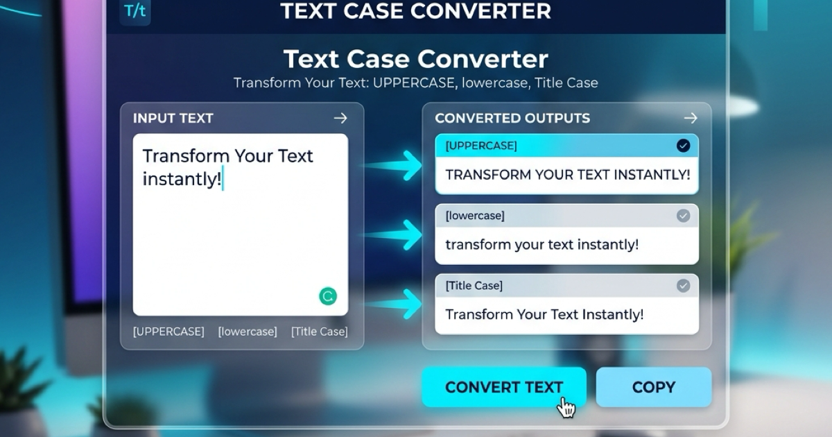
So verwenden Sie den Groß-/Kleinschreibung-Konverter für eine bessere Inhaltsformatierung
Erfahren Sie, wie Sie Text sofort zwischen Großbuchstaben, Kleinbuchstaben, Titelformat und mehr umwandeln können. Verbessern Sie Ihren Schreibworkflow mit unserem Online-Textkonverter.