

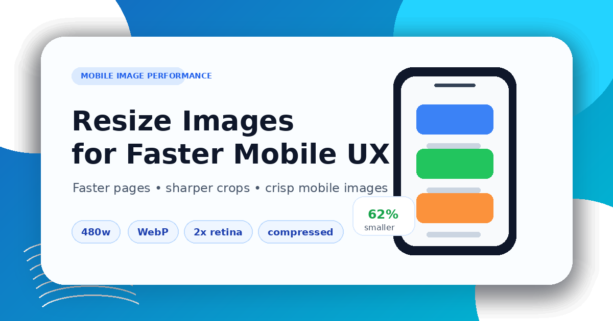
How to Resize Images for Better Mobile Performance
How to Resize Images for Better Mobile Performance
Mobile visitors often load pages on smaller screens, slower networks, and high-density displays. If your site sends the same oversized desktop image to every device, the page becomes slower than it needs to be.
A practical workflow is to resize images first with the Image Resizer, compress the result with the Image Compressor, and convert formats with the Image Converter when WebP, JPG, or PNG is a better fit.
Why mobile image size matters
Large images affect three things at once:
- page speed and Core Web Vitals
- mobile data usage
- how sharp or blurry the image looks after scaling
The goal is not to make every image tiny. The goal is to deliver an image that is large enough for the layout, but not much larger than necessary.
Start with the displayed size
Before resizing, check where the image appears:
- full-width hero image
- product gallery image
- blog cover image
- card thumbnail
- icon or logo
A blog card thumbnail may only need a few hundred pixels of width. A hero image may need a wider export, especially for high-density screens.
Keep the aspect ratio consistent
Stretching an image to fit a mobile layout usually looks worse than cropping or resizing properly. Keep the original aspect ratio when possible. If the design requires a fixed ratio, crop deliberately instead of distorting the image.
For social and blog covers, prepare a dedicated 1200×630 image. Do not squash a portrait image into that shape; use a centered composition with safe margins.
Use compression after resizing
Resizing reduces dimensions. Compression reduces bytes. You usually need both.
A good workflow:
- Resize the image to the target width or ratio
- Export in the best format for the image type
- Compress the output
- Preview it on a phone-sized screen
- Check text, faces, product edges, and transparent areas
Choose the right format
For mobile pages:
- use JPG for photographs when transparency is not needed
- use PNG for transparency, screenshots, and sharp UI details
- use WebP when you want a smaller modern web image
If you are unsure, convert a copy with the Image Converter and compare the result visually.
Final checklist
Before publishing, confirm:
- the image is not larger than the layout needs
- the aspect ratio is preserved
- important content is not cropped out on mobile
- the file is compressed
- the image still looks sharp on high-density screens
Mobile image performance is mostly about preparation. Resize first, avoid stretching, compress carefully, and preview the final result where users will actually see it.
Related Posts
How to Compress Images for Faster Page Speed
A practical workflow for smaller pages, cleaner Core Web Vitals, and fewer visual artifacts.
Bilder vor dem PDF-Export vorbereiten
Praktische Checkliste zum Skalieren, Komprimieren, Sortieren und Konvertieren von Bildern vor dem PDF-Export.